

Grocery e-commerce · 2023
Grocery Delivery App
A grocery service for the food a supermarket doesn't carry — Asian, African and Middle-Eastern products, in French.
- Android
- iOS
- Kotlin
- Firebase
- Mobile App Development
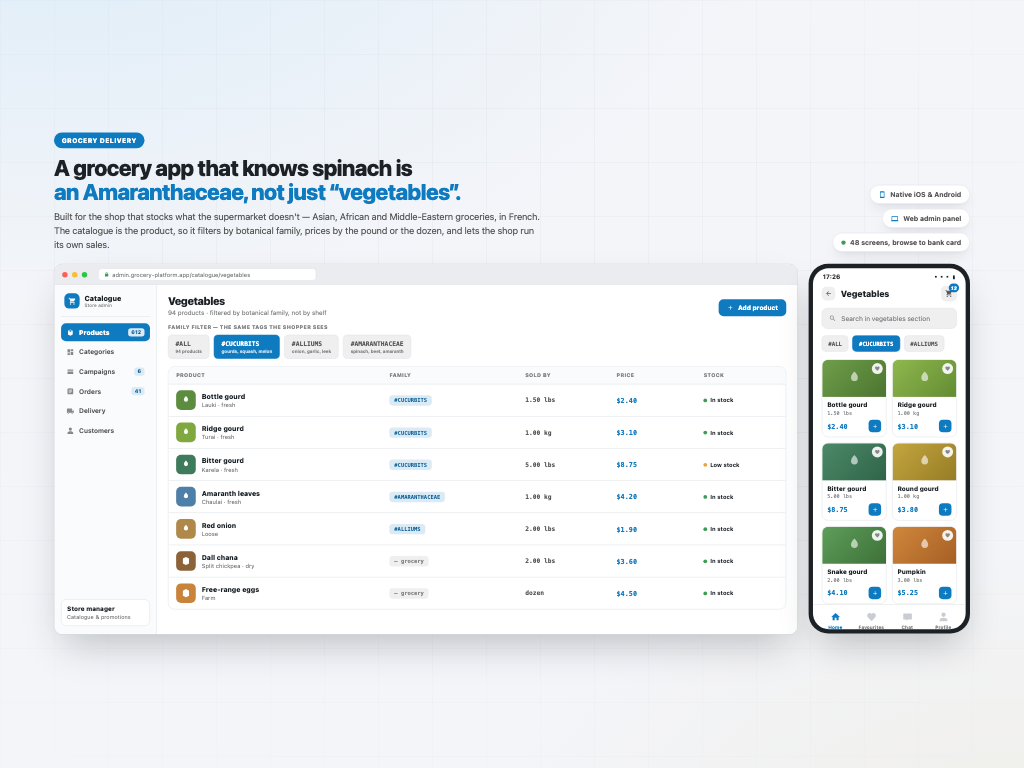
A grocery service for the food a supermarket doesn't carry — Asian, African and Middle-Eastern products, in French. The catalogue drives the design. Vegetables filter by botanical family — gourds, the onion family, the spinach-and-beet family — because that is how someone hunting an ingredient actually searches. Items sell in whatever unit is real: a kilo, five pounds, a dozen. Every basket line has its own tick, so you buy four things now and leave the rest. Three delivery speeds, five-stage tracking, saved cards and PayPal. Design, native iOS, native Android and a web admin panel.
The niche is the product
Most grocery apps are interchangeable because the shops behind them are. This one isn't. It exists for the food a supermarket doesn't carry — Asian, African and Middle-Eastern groceries, in French — and the catalogue is what the whole design is built around.
So the vegetables section doesn't filter by shelf. It filters by botanical family: All, Cucurbits, Alliums, Amaranthaceae — gourds, the onion family, the spinach-and-beet family. That is a real domain taxonomy, and it is how someone hunting a specific ingredient actually searches. Search is scoped the same way, inside the section you are already in rather than across everything.
Units follow the same logic. Not everything is a kilo: 1.50 lbs, 5.00 lbs, 1.00 kg, a dozen — each product carries how it is genuinely sold, and is priced against that.
The web admin panel is where the shop maintains it, with the same family tags the shopper sees.
A shop that can run its own promotions
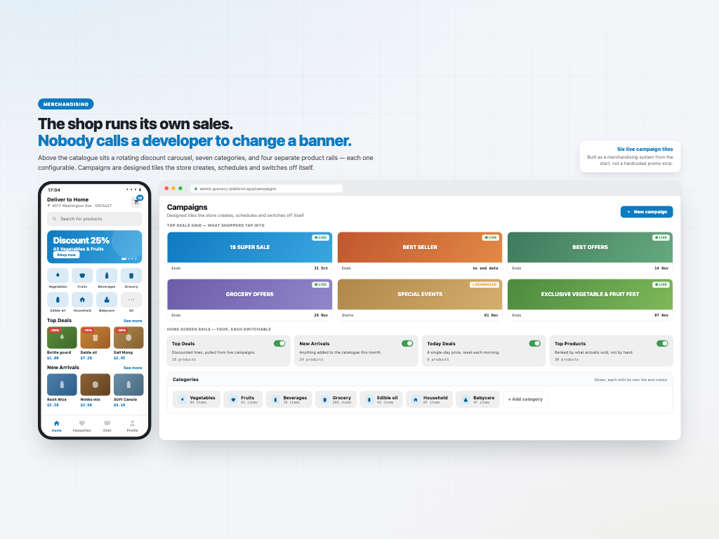
Above the catalogue sits a rotating discount carousel, then seven categories — vegetables, fruits, beverages, grocery, edible oil, household, babycare — then four independent product rails: Top Deals, New Arrivals, Today Deals and Top Products, each with its own See more.
Top Deals opens into a grid of designed campaign tiles: 1$ SUPER SALE, BEST SELLER, BEST OFFERS, GROCERY OFFERS, SPECIAL EVENTS, EXCLUSIVE VEGETABLE & FRUIT FEST.
Those are not hardcoded images. They are records the shop creates, schedules and switches off from the admin panel, which means a grocer can run a weekend sale without booking developer time. For a business with thin margins and perishable stock, that is the difference between reacting to a glut on Friday and writing it off on Monday.
A basket you don't have to empty
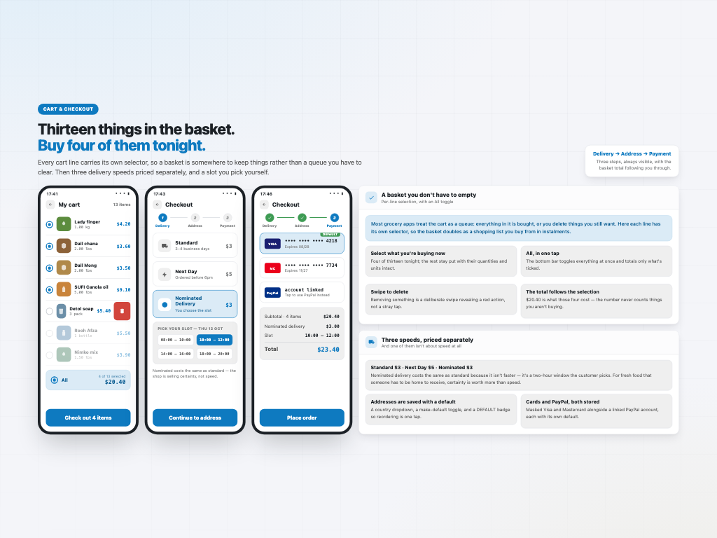
Every line in the cart carries its own selector, with an All toggle on the summary bar. Thirteen things in the basket, buy four tonight, leave nine for next week — and the total only ever counts what is ticked. Deleting something is a deliberate swipe that reveals a red action, not a stray tap.
That one decision turns the cart from a queue into a running shopping list, which is what a weekly grocery shop actually needs.
Checkout is a three-step progress bar — Delivery, Address, Payment — with three speeds priced separately: Standard $3 over three to four business days, Next Day $5, and Nominated Delivery at $3 where the customer picks their own slot. Nominated costs the same as standard because it isn't faster; the shop is selling certainty. For fresh food that someone has to be home to receive, that is worth more than speed.
One lifecycle, two very different jobs
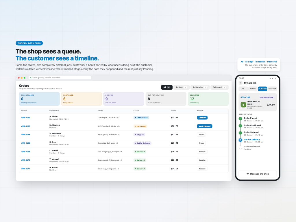
Orders move through five stages — Order Placed, Order Confirmed, Order Shipped, Out for Delivery, Order Delivered. Completed stages carry the date they happened; the rest simply read Pending.
The customer sees that as a vertical timeline against their order. Staff see the same five states as a queue sorted by what needs a person next, with the count sitting at each stage.
And the customer's own order list is organised by fulfilment stage rather than by date — All, To Ship, To Receive, Delivered — each row carrying the product, the amount and its own action button. Sorting by date tells you when you ordered; sorting by stage tells you what is still coming.
Built for the second order, and what was delivered
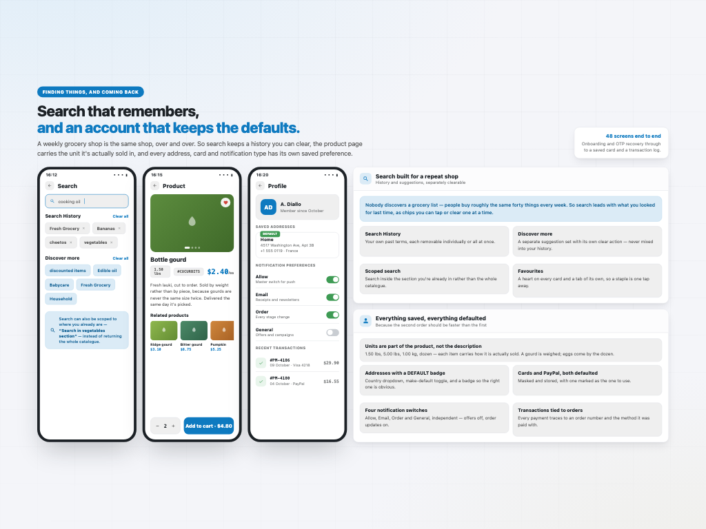
Nobody discovers a grocery list. People buy roughly the same forty things every week, so the app is built to make the second order faster than the first.
Search leads with Search History and Discover more as separate chip sets, each independently clearable. Favourites get a heart on every card and a tab of their own. Product pages carry a photo carousel, a description, the unit and related products.
The account keeps every default that matters: an address book with a country dropdown, a make-default toggle and a DEFAULT badge; saved Visa and Mastercard alongside a linked PayPal account, each maskable and defaultable; a transaction history tied to order numbers; and four independent notification switches — Allow, Email, Order and General — so offers can be off while order updates stay on. Onboarding, OTP password recovery with resend, and in-app chat as a permanent tab round it out.
Four surfaces on one contract: UI design, a native iOS app, a native Android app and a web admin panel, over Firebase. The Android build alone is 122 source files, 8,655 lines, 77 layouts and 37 screens, in the best-organised package tree of the three Android apps I delivered that year.
The design came from a designer on my team under the same contract — I led the delivery; I didn't draw the screens. Built and published to both app stores. Client work, so the source is private.