

Services marketplace · 2022
Services Marketplace
Most services apps pick a lane: trades, or freelancers. This one runs both, off a single field in the listing form — do you do this work in person, or remotely?
- Android
- iOS
- Kotlin
- Firebase
- Mobile App Development
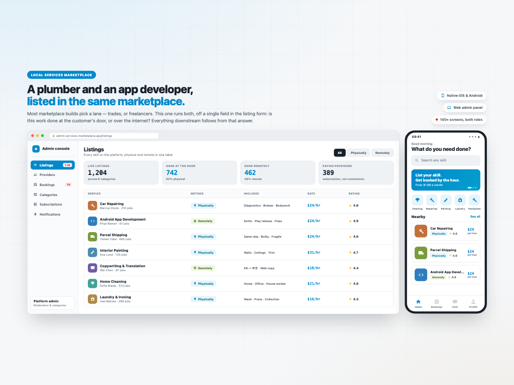
Most services apps pick a lane: trades, or freelancers. This one runs both, off a single field in the listing form — do you do this work in person, or remotely? Everything is booked by the hour, and both sides watch the same countdown while the job runs. The worker confirms or declines the request, then marks the job finished — but can't close it. The customer accepts the completion, so nobody marks their own homework. Workers pay a subscription rather than a commission on every job. Design, native iOS, native Android and a web admin panel.
One question splits the whole market
Services marketplaces almost always choose a side. Either it's cleaners, plumbers and handymen booked by location, or it's designers and developers hired by skill. The two need different products, so nobody builds one.
This app asks a single question on the listing form — Work Method: physically, or remotely — and that one field is what lets a plumber and an Android developer sit in the same Nearby list at the same hourly rate. It is the reason the product is called what it is.
The customer's home screen makes the point better than any description: Car Repairing, Parcel Shipping and Android App Development, one under the other, all priced by the hour. The web admin console makes it structural — every listing on the platform in one table, filterable by method, with the physical and remote split shown as a live figure.
One timeline, two sets of buttons
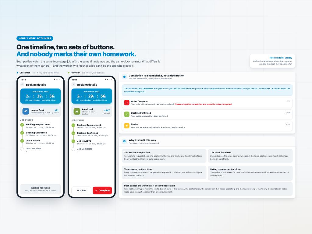
Every booking carries four stages with real timestamps against them — request sent 09:00, confirmed 13:50, started 18:18, complete. Both parties see the identical timeline; what differs is what each of them can do.
While a job is running, both sides watch the same live countdown at the top of the screen — 2 hr : 29 M : 56 S, against the hours booked. Hourly work with a visible clock removes the argument that usually follows it.
And a worker marking their own job complete is how disputes start, so here they can't. The worker taps Complete and is told: you will be notified when your services completion has been accepted. The customer gets a notification written as an instruction rather than an announcement — please accept his completion and make the order completed — and only when they accept does the job close and the rating open.
Four notification types carry that workflow rather than decorating it: the request, the confirmation, the completion that needs accepting, and the review prompt.
Four steps, twelve photos, one decisive field
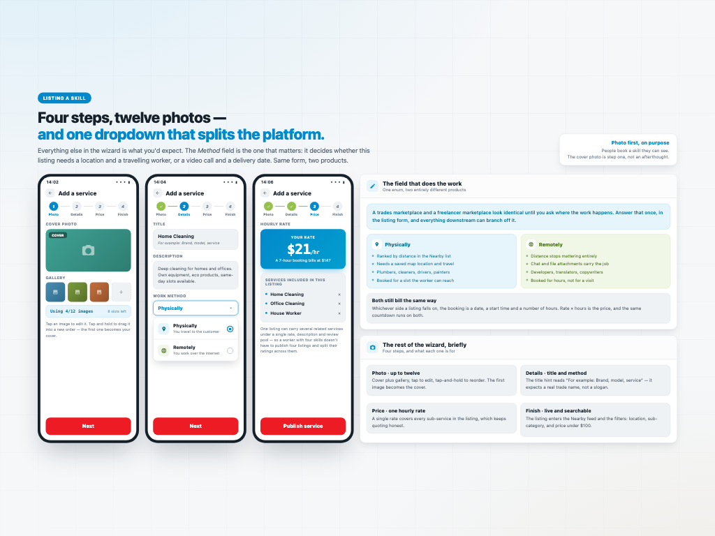
Listing a service is a four-step wizard — photo, details, price, finish. The photo step takes up to twelve images with tap to edit and tap-and-hold to reorder, and the first becomes the cover. The title hint reads “For example: Brand, model, service”, so it expects a trade name rather than a slogan.
The Method dropdown is the one that matters. Physically means the listing ranks by distance, needs a saved map location, and is booked for a slot a worker can travel to. Remotely means distance stops applying entirely and chat with file attachments carries the job instead. Same form, two products.
One listing can also carry several related skills rather than forcing four separate posts: a cleaner advertises home cleaning, office cleaning and house work on a single page, under one rate, one description and one shared review pool.
Both sides of the split still bill identically — a date, a start time, a number of hours, and rate times hours as the price.
The same build becomes a different product by role
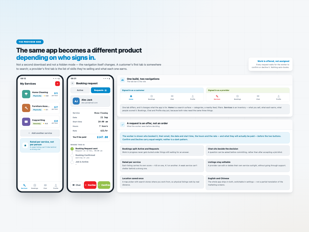
The navigation itself changes with who signs in. A customer's tab bar reads Home, Bookings, Chat, Profile, where Home is a search surface — categories, a nearby feed, filters for location, sub-category and price under $100. A provider's reads Services, Bookings, Chat, Profile, where Services is an inventory: what they sell, what each earns, and what people scored it.
One tab differs, and it changes what the app is for. The other three stay put, because both roles need them.
Work is offered, never assigned. An incoming request shows the worker who booked it, their email, the date and start time, the hours, the rate and what they will actually be paid — and only then the buttons. Confirm and Decline carry equal weight. Bookings splits into Active and Requests so work in progress is never buried under things still waiting for an answer.
Each listing is rated on its own — 4.8 on one service, 4.1 on another — so a weak listing can't shelter behind a strong one. Providers can edit or delete their own services outright, and the whole app ships in English and Chinese.
How it earns, and what was delivered
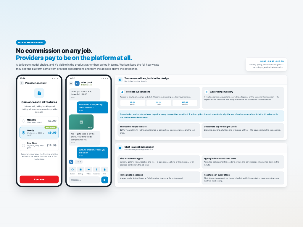
Providers pay to be on the platform rather than losing a percentage of every job — $1.99 monthly, $9.99 yearly, or $18.99 once and for good. Customers pay nothing at all: browsing, booking, chatting and rating are free on their side. A second revenue line sits above the categories on the home screen as a rotating banner carousel, designed in from the start rather than retrofitted.
That choice shapes the product. A commission marketplace has to police every transaction to collect its cut; a subscription doesn't, which is why the workflow here can afford to let the two parties settle the job between themselves.
Messaging is a real messenger, because the job gets negotiated in it: typing indicators, inline photo messages, per-message timestamps, and five attachment types — camera, gallery, video, location and file.
Four surfaces on one contract: UI design, a native iOS app, a native Android app and a web admin panel, all over Firebase. The Android build alone is 107 source files, 10,784 lines, 68 layouts and 33 screens.
The design came from a designer on my team under the same contract — I led the delivery; I didn't draw the screens. Built and published to both app stores. Client work, so the source is private.