

Travel · carpooling · 2021
Intercity Carpooling App
Cape Town to Pretoria is fourteen hours, and somebody is driving it on Saturday with three empty seats.
- Android
- iOS
- Mobile App Development
- Firebase
- Google Maps API
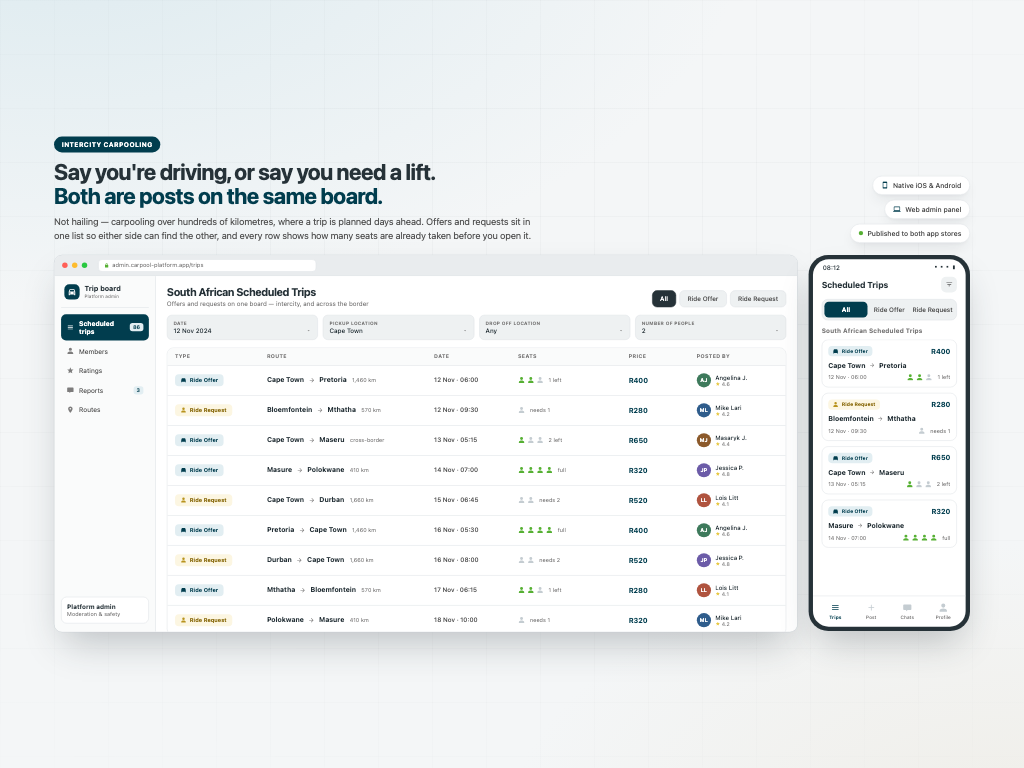
Cape Town to Pretoria is fourteen hours, and somebody is driving it on Saturday with three empty seats. This puts both sides on one board. You post that you are driving and have room, or that you need a lift — both sit in the same list, so whichever side you are on you are looking at the other. Seats show as filled or free on the row itself. Nobody joins your car without approval: you see their name, gender, rating and vehicle first. Every trip gets its own group chat, and location sharing is per person rather than broadcast. Design, native iOS, native Android and a web admin panel.
Both directions, one board
This is not urban hailing. Cape Town to Pretoria is fourteen hours and roughly 1,460 kilometres, and somebody is driving it on Saturday with three empty seats.
So two kinds of post live in the same list. A Ride Offer says I am driving this route on this date and I have room. A Ride Request says I need to get there on this date, has anyone got space. They sit together, distinguished by icon and colour, which means whichever side you are on you are already looking at the other.
Occupancy is on the row itself — person icons filled in for seats taken and greyed for seats still free — so you never open six trips to find one with room. Filters match how the journey is actually planned: offer or request, date, pickup location, drop-off location and number of people.
The board runs intercity and across the border. The web admin panel behind it moderates the same list.
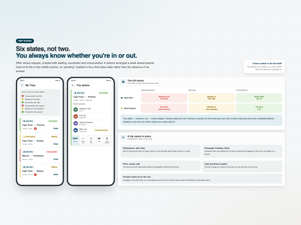
Six states, because two would lie
Personal trips are colour-coded across a full matrix, and the legend sits on screen so a colour never has to be guessed at: unsuccessful ride offer, waiting on ride offer, successful ride offer, and the same three again for requests.
Offer versus request, crossed with failed, waiting and succeeded. A carpool arranged a week ahead spends most of its life in the middle column, and “nobody has replied yet” is a completely different situation from “nobody is coming” — only one of them means you need a plan B. Two states would collapse both into the same grey row.
A trip expands in place with everything it needs: the participants and their roles, anyone still flagged as Passenger Pending, and one strip carrying the price, cancel trip, edit trip, chat and share location. Unread counts sit as badges on the row, so a message about tomorrow's 6am pickup doesn't wait behind a separate inbox.
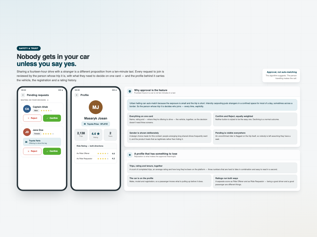
Nobody gets in your car unless you say yes
Urban hailing can auto-match because the exposure is small and the trip is short. Putting strangers in a confined space for most of a day is a different proposition, so every request to join is approved by the person whose trip it is.
The decision card carries what is needed to make it: name, gender and star rating — and where someone is offering to drive, the vehicle too. Confirm and Reject are weighted equally; declining is a normal outcome, not a hidden one. Showing gender is a deliberate choice for this context rather than an oversight.
Behind that sits a profile with something to lose: completed trips, an average rating and time on the platform, plus the make, model and registration of the car. Ratings run in both directions — a separate score as Ride Offerer and as Ride Requestor, because being a good driver and a good passenger are not the same skill.

A group thread, and sharing that isn't a broadcast
Four to six people who have never met need to agree a departure time, a meeting point, and what happens when somebody drops out two days before. A one-to-one thread cannot carry that.
So every trip has its own conversation headed by the route, with real group mechanics: role labels on messages so you know whether the person setting the time is the one driving, membership events recorded inline when someone is added or removed, and @mentions for directing a message at one person inside a group of six.
Location sharing is per person, not broadcast. Every participant is listed with their own selector and you choose who receives it — telling the driver where you are waiting is a different decision from telling four strangers. The accuracy is stated on the screen, and the group thread records that a share happened without exposing the location itself. Address search and nearby places mean a pickup point can be named rather than dropped as a raw pin.
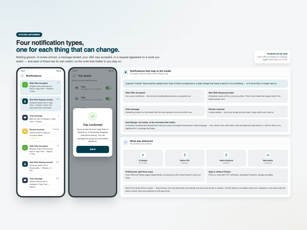
Four notification types, and what was delivered
A generic activity feed would be useless here, so there are four types and each maps to a state change someone has to act on: a ride offer accepted, a new ride request posted on a route you drive, a chat message with the route named, and a review received — which says which role it was for, since ratings are two-sided.
Preferences split three ways as well: Chat, Offer and Rating toggle independently, so being finished with reviews doesn't mute your driver.
Trip confirmed, cancelled and rejected each get a proper dialog in plain language rather than a toast that fades. A trip cancelled two days before a fourteen-hour drive is significant enough to stop the screen and say who, which route and which date. Sign-up is phone or email with OTP verification, alongside Facebook, Google and Apple.
Delivered on one contract: UI design, a native iOS app, a native Android app and a web admin panel, over Firebase. Built for the South African market — Rand pricing, and a trip board that runs intercity and across the border to Lesotho. The design came from a designer on my team — I led the delivery; I didn't draw the screens. Built and published to both app stores. Client work, so the source is private.